Varisha media 2
Social media and branding
INSPIRATIONS
Our inspirations remianed the same for instagram. For more in depth info go back and check out the social media section in the INITIAL PLANNING


COLOUR PALLET


Me and Saman had pretty similar ideas for a colour pallet. We wanted bright and cheery colours to match the vibes of our short film. From the above colour pallets we stuck with light blues, light yellows, white and browns:


The Mascot
THE LOGO
The logo remained the same. For a more detailed production process of the logo check out INITIAL PLANNING

TYPOGRAPHY

We went through a bunch of fonts to find a font to use for the title. The above fonts were all great candidates but in the end we chose two fonts as our branding fonts:


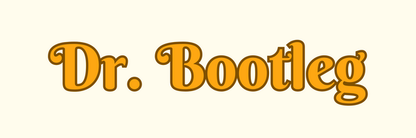
Final title:
INITIAL POSTS
We decided to follow the same format for our social media posts. As shown in the INSPIRATION section, we loved the coming soon banner idea. We wanted to start of our social media account with it to create audience anticipation. Along with that we wanted to show off the studio's logo and decided to add a logo banner on top of that. As saman was again stuck in editing jail I took on the responsibility of posting content on social media and keeping our audience updated

.jpg)
Here is the ideas sketched out for the coming soon banner (first two by me and the last one by saman):


We took forward Saman's idea of incorporating the duck and chick and she drafted out these rough drafts


I loved the secound one so I asked Saman to send a brighter picture for the final banner. I then imported it to canva, put a filter on it to colour grade it according to the film and slapped out signature Old Standard text on it


Me and Saman discussing whether to add a shadow or not. We decided not to:

Film studio banner:

The next set of posts were the film banners. I took screenshots of the film and imported them into canva to create these bannners:


The intro video was the same video as the BTS video posted above. Scroll to the BTS section to learn more about it's production
Initial posts done:

HIGHLIGHTS AND STORIES
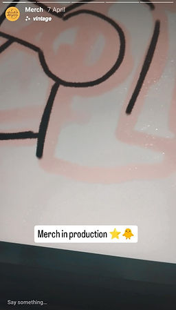
Taking advantage of one of Instagram's most engaging features I made sure to post stories and highlights throughout working on the project to keep audiences engaged and updated. This allowed them a sneak peak into our production process for all three products


MERCH AND FINAL INSTAGRAM
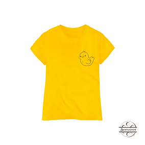
Me and Saman hopped on call to discuss what we could make for merch. I decided to utilize my illustrative skills to the fullest for this section because I love designing products


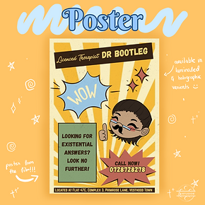
Our finalised list of merchandise:
-
Mug
-
Sticker Pack
-
Poster from film
-
T shirts in two varients
I went to work designing all the illustrations and the PNGs for the merchandise. The poster I had already designed so the sticker pack was the main thing to draw out. From the sticker pack I send over the duck png so that Saman could add it to the t-shirts with her sweet sweet canva pro:
Final merch designs:


Final instagram layout for postcard and merch:

CHECK OUT OUR INSTAGRAM HERE (CLICK):

A WEIRD GLITCH
As you can see that our grid posts look great right? Well after consulting the audience we found that Instagram had suddenly switched to a 4:5 ratio for their posts. IT COMPLETLY RUINED OUR GRIDS!!! so we had to redo them...(sometimes I wonder why I chose the life of a pro-am)
After what felt like eternity this was our new instagram:

We changed up the post card grid because it wasn't formatting well in the 4:5 ratio