Varisha media 2
Short Film
INITIAL IDEAS
Me and Saman wanted to tackle themes of perfectionism as we got inspired by “The Big Shave.” These were some of the ideas we came up with in the beginning:
-
An eerily perfect family living in a perfect neighborhood. However, the town has is creepily perfect. Drawing heavy inspiration from the Autodale franchise, the characters where supposed to wear masks to conceal their face, making them perfect. If any family was ‘imperfect’ they would be ‘taken care of by government forces’. It had mainly dystopian horror themes.
-
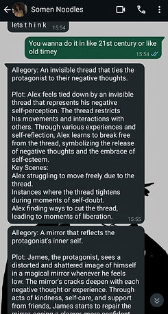
Alex perceives his bad self-perception as being bound by an unseen thread. His movements and social contacts are limited by the thread. Through many encounters and self-reflection, Alex learns to break free from the thread, signifying the release of negative beliefs and the acceptance of self-esteem.
-
A mirror that reflects the protagonist's inner self.
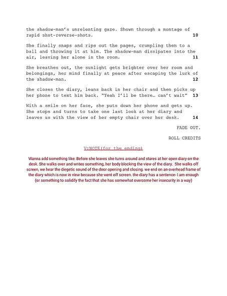
We took forward idea number 2 and changed it a bit to get our initial idea:
Main protagonist is drawing to distract herself from her insecurities. One of her drawings come to life in the form of the ‘shadow man’. He bombards her with self-deprecation thoughts and clings onto her. He represents her insecurity, burdening her mind with such thoughts.
There would be no dialogues, just music and sfx to increase the dramatic effect of the short film. Low and natural lighting would be used and the entire film would take place in one room.
Finally, me and Saman finalized an idea that would combine animation and live action drama films. We decided to make the shadow man animated and blend him seamlessly into real life.

SCRIPT
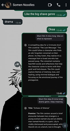
Saman sent me the first draft of our script after we decided on our final idea. Initially we had decided on minimal to no dialogue but later changed that idea as we wanted to not only immerse the audience into the main characters thoughts but also avoid any confusion about the story that could stem from no dialogues at all. Saman also added a subplot of the main character being asked out which I felt really helped to tie up the narrative.
As for the name of the main character...well in Saman's words "I used my own nickname for the draft, given my indecisivness on names and named the boy Aaron after, well, my massive crush on the criminal minds character Aaron Hotchner." (girlhood at its finest). We went with the name because we both are massively indecisive (the true reason was to let Saman live out her fantasy of dating Aaron Hotchner)
First Draft:


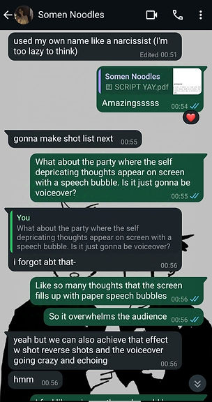
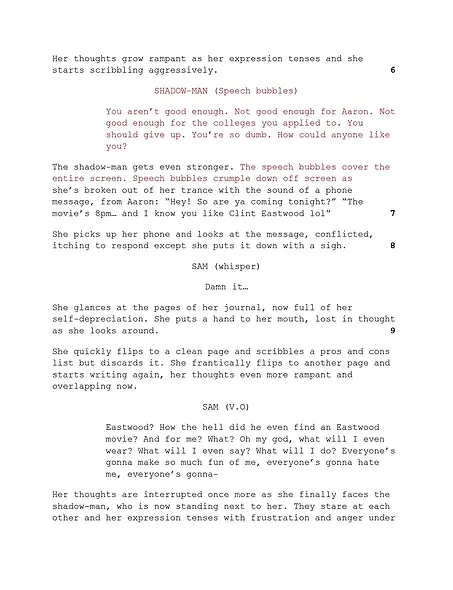
I had a few changes in mind which I discussed with Saman and added them to the script in red.


Second Draft:

NAMING THE FILM
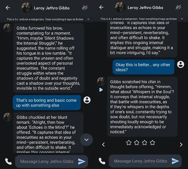
With making any form of media we must unfortunately name it too. When it comes to these things I'm extremely indecisive. Me and Saman decided to make it a little fun and consult the person who has been there for us since the beginning of this journey.....Character AI. I decided to ask Writing buddy for some ideas:

Saman or should I say Simp-man (ok that was bad) decided to ask the help of NCIS' Jethro Gibbs because...its Saman. I have no other explanation for you...
Here is us in person discussing and writing down ideas. We are very serious and professional individuals as you can see...
This is what we came up with (and what I was repeated trying to. a failing to, show the camera

In the end Mr. Jethro Gibbs did provide us with our final two choices which were 'Echoes in the Mind' and 'Whispers in the Soul' so I suppose a thank you to Saman's impeccable tastes are in order.
MAIN CONCEPT

INITIAL SHOOT/TEST


STORY BOARDS


MISE-EN-SCENE
PROPS
-
Sketchbook
-
Pencil
-
Lamp
-
Desk set up: Notebooks, pens, sticky notes
-
Crumpled paper/Journal
-
bin
LIGHTING: low lighting, natural lighting (window). Lighting will reflect her emotions (Bright light will reflect her fresh start and overcoming her negative emotions)
SETTING: One room, desk
MUSIC: music track that reflects the character’s inner turmoil. When her negative emotions get too much to bear, the music gets louder and overbearing.
Mise-en-scene mood board


LOCATION

My bedroom was our filming location! (I have a pretty sweet bedroom I know). Me and Saman decided this because we needed a desk and a big window to provide natural light.
DESK/PROPS

MEET THE CHARACTERS
.jpg)
I've always loved designing characters so I took on the task of designing our leads here.
On the left you'll see Sam, our main girl and the star of the show. She is your conventionally insecure teen so I decided on giving her baggy clothes as a sign of that.
On the right we have the big bad shadow man, basically Sam's insecurities in a humanoid monter form. Other that constently whispering insecure thoughts into Sam's mind he really is just a chill guy (jk :P)
MEET THE CREW

SAMAN ZAHRA as SAM and my CO-DIRECTOR

RAIMA ZIA as SHADOW MAN

VARISHA KHURSHID (ME) as CAMERA MAN AND ANIMATOR
ROTOSCOPE TEST
BTS PICTURE :)

SOUND DESIGN
Initially, me and Saman though we would ask our friend to compose a custom sound track for the film to really emphasize emotions in the places we wanted to and complement the narrative. However, with all of us being A level students (sigh...) we didnt have the time to do that. Saman, being the life saver she is was able to find ambient sounds for the room as well as music for the day dream sequence. I gotta hand it to her, her grandma taste is music is pretty good....don't tell her I said that though haha..
Saman really got my vision about the "uncomfortable silence" I preferred for the short film's opening (soulmates truly). Here is what she chose:
When it came to the day dream sequence, Saman presented forward two options . Her "impeccable music taste" (so very humble) as she says in her blog really did pay off and ill confess...Escape(The Pina Colada Song) may or may not have made its way into my Spotify playlist (again no one tell Saman). Both of us are leaning more towards Escape(The Pina Colada Song).


Here is me and Saman discussing the sound and songs:


Social media
INSPIRATIONS

The logo banner

Loved the coming soon banner idea
Screencaps from the movie as banners

COLOUR PALLET

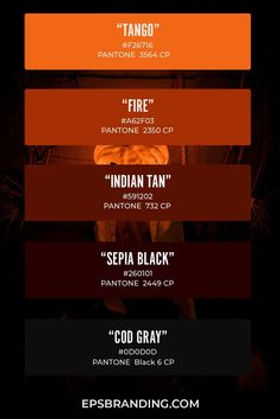
Me and Saman had pretty similar ideas for a colour pallet. We wanted warm and muted colours to match the vibes of our short film
THE LOGO
The name of our studio was decided fairly quickly. We decided to call it Film Geek Studios. Why you may ask? Well if it wasn't already obvious, me and Saman are huge nerds when it comes to anything film.
Below are the initial sketches I did for our logo:

We weren't really vibing with these renditions and wanted something more professional and something that showed of ':G' more. Saman came up with some ideas:

Taking this idea forward I decided to take some inspiration from one of my favourite games Bendy and The Ink Machine. The logo for the animation studio within the game really called out to me and it became the main inspiration for our logo.


Here is how our final logo turned out:


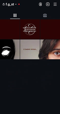
INITIAL POSTS
As shown in the INSPIRATION section, we loved the coming soon banner idea. We wanted to start of our social media account with it to create audience anticipation. Along with that we wanted to show off the studio's logo and decided to add a logo banner on top of that.
Here is me and Saman discussing the initial ideas for the account:


Here is the idea sketched out for the coming soon banner:

We decided to take a picture and then I drew in the shadow man later:


The studio logo banner:

Here is how it looked posted on our instagram account:
Click the picture to check out the insta page!

Later we planned out the rest of the posts (we are amazing at planning I promise). We wanted to start with a coming soon banner to create audience anticipation. After that the film studio's banner would be put up followed by screen caps from the film as banners. The introduction video will be a short director interview plus behind the scene mash up.
The next set of posts we agreed upon was the post card followed by the merch. Here you can see me and Saman talking about it amidst our shenanigans:
.jpg)

Post Card
Here are some of the colour pallet choices we picked out for the post card. As you can see they are very similar to the social media page's because we wanted to keep brand continuity


The mood board below shows our inspirations and what we want to include within the post card. It also shows what shots we want to use for it. Preferable something that shows both Sam and the shadow man head on:

Some more inspiration we really liked:

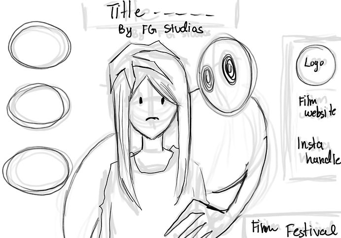
The initial sketch I made for the postcard layout:
.jpg)
After much discussion with Saman and our media teacher we decided to make our post card portrait instead of landscape. The sketch I created below drafts out the rough placement of the postcard elements:

WHY IT DIDN'T WORK OUT
Me and Saman collectively decided to start over completely from scratch as we faced many hurdles that we couldn't jump over during the short time period we had left. Moreover, our genre started feeling a little boring to us and we found it hard to keep this idea engaging. If we look at the animation aspect of things, I personally wasn't satisfied with the level of rotoscoping I was producing and didn't want to add it to the final product. Additionally the animation of taking too long and wasn't feasible within our time constraints. So we decided to go back to the drawing board...and boy I'm so glad we did:

